
Most ecommerce sites don’t fail because the logo isn’t pretty, they fail because customers hit friction at the exact moment they’re ready to buy. The numbers back that up: Baymard Institute’s long-running research regularly reports cart abandonment around 70% across ecommerce, largely driven by preventable UX and trust issues like surprise costs, forced accounts, and confusing checkout flows.
If you’re searching for ecommerce website design services (especially as a nontechnical founder or a busy local business owner), your real goal is not “a new site.” It’s a site that reliably turns traffic into revenue, with a checkout that feels effortless and a storefront that earns trust fast.
What “converting” actually means for ecommerce (and what to measure)
A conversion-focused ecommerce build starts by defining success beyond “sales.” Yes, purchases are the primary conversion, but your site should also create smaller wins that lead to purchases.
Common ecommerce conversion metrics a good design team will plan for:
- Purchase conversion rate (sessions to orders)
- Add-to-cart rate (product page clarity and confidence)
- Checkout completion rate (friction and trust)
- Average order value (AOV) (bundling, upsells, merchandising)
- Email/SMS capture rate (future revenue, abandoned cart recovery)
- Return customer rate (post-purchase experience and retention)
Conversion is rarely one “magic” change. It’s the result of dozens of small, compounding decisions in layout, copy, speed, mobile usability, and integration quality.
The conversion pillars behind ecommerce website design services that work
Below are the core areas that separate a storefront that looks good from a storefront that sells.
1) Merchandising and navigation that match how people shop
Your navigation and category structure are not just “site organization.” They’re your digital version of store aisles and endcaps.
A conversion-focused ecommerce information architecture typically includes:
- Clear top-level categories (not clever labels)
- Collection pages that help users scan quickly (filters, sorting, best sellers)
- Search that doesn’t feel broken (typos, synonyms, “no results” recovery)
- A consistent path back to relevant categories from every product page
If customers can’t quickly answer “Do you sell what I want?” they bounce, even if the product is great.
2) Product pages that remove doubt (before the customer asks)
Your product detail page (PDP) is where most buying decisions happen, especially on mobile. The goal is to eliminate uncertainty.
High-converting PDPs usually get these basics right:
- Images that do the selling (multiple angles, context shots, zoom)
- Price clarity (including discounts and subscription terms if applicable)
- Shipping and returns transparency (costs, timelines, local pickup options)
- Social proof (reviews, testimonials, UGC when available)
- Strong “why this” copy (benefits, sizing, materials, care instructions)
- Trust cues (secure checkout, guarantees, real business info)
A subtle but important conversion detail: don’t hide critical info behind tabs and accordions that mobile users never open. A good team will decide what must be visible by default.
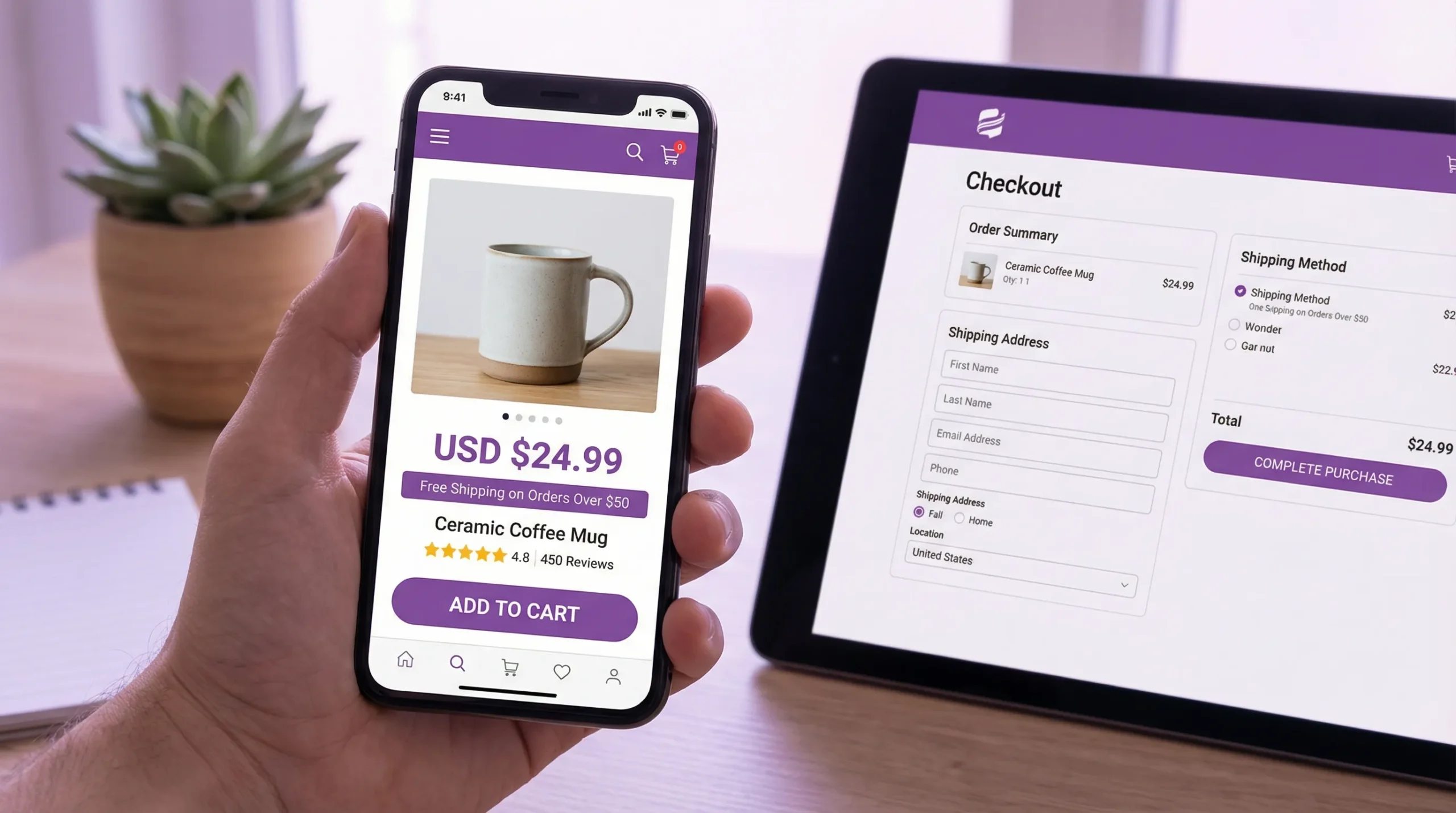
3) Checkout UX that is fast, predictable, and low-anxiety
Checkout is where revenue leaks happen. Even small surprises can kill a purchase.
Baymard’s research repeatedly highlights common abandonment triggers such as extra costs, mandatory account creation, and complicated checkout steps. Your design partner should proactively engineer around these issues.
Conversion-focused checkout patterns often include:
- Guest checkout (or frictionless account creation after purchase)
- Upfront shipping/tax expectations (as early as practical)
- Express payment options (where supported by your platform)
- Minimal form fields and smart defaults
- Clear error states that explain how to fix the issue
Also, make sure “support” is present at the moment of decision: visible contact options, policy links, and reassurance near payment.
4) Mobile-first design that respects thumbs and attention
Mobile-first is not about shrinking desktop designs. It’s about designing for the realities of mobile shopping: one-handed browsing, interruptions, smaller screens, and slower connections.
Practical conversion rules for mobile ecommerce:
- Tap targets large enough to hit without precision
- Sticky add-to-cart (when appropriate)
- No intrusive popups blocking product info
- Filters that are usable and easy to reset
- Checkout inputs optimized for mobile keyboards (email, phone, postal code)
If you serve local customers in Los Angeles or the Inland Empire, mobile matters even more because discovery often happens on the go (Google Maps, Instagram, TikTok, etc.).
5) Speed and Core Web Vitals (performance is conversion)
Performance is not a technical nice-to-have. It directly impacts bounce rates, product page engagement, and checkout completion.
Google’s Core Web Vitals focus on real user experience signals like loading speed, responsiveness, and layout stability. A conversion-minded ecommerce build should treat these as baseline requirements, not post-launch cleanup.
Common ecommerce performance culprits:
- Uncompressed images and oversized media
- Too many third-party scripts (pixels, widgets, trackers)
- Heavy themes and page builders that load everything everywhere
- Poorly implemented sliders, popups, and review apps
Ask your design team what performance budget they target and how they validate it (real-device testing, Lighthouse checks, field data when available).
6) Accessibility that expands your market and reduces risk
Accessible ecommerce is good business. It improves usability for everyone, including customers on mobile, customers with temporary impairments (like a broken screen), and customers using assistive technologies.
A professional team should be comfortable building toward modern accessibility expectations (often aligned with WCAG guidance) and should treat accessibility as part of UX, not as a legal checkbox.
In practical terms, this means:
- Proper contrast and readable typography
- Keyboard navigability
- Labels and error messaging that work with screen readers
- Focus states that make sense
7) Ecommerce SEO that brings in buyers, not just traffic
SEO for ecommerce is different from SEO for service businesses. You’re not just trying to rank a homepage, you’re building a scalable structure for categories, collections, and product pages.
Conversion-friendly ecommerce SEO work includes:
- Clean URL structures and internal linking
- Indexation strategy for filters and variants (to avoid thin or duplicate pages)
- Structured data (schema) where appropriate
- Strong on-page copy that helps shoppers decide (not just keywords)
A key point: “SEO content” should not sabotage conversion. The best ecommerce pages balance discoverability with clarity.
8) Analytics and tracking you can actually use
If you can’t measure it, you can’t improve it. But tracking should be intentional, not a messy pile of tags.
At minimum, your ecommerce site should be set up to answer:
- Which channels drive purchases (and which drive bounces)
- Which products get views but not add-to-carts
- Where checkout drop-off happens
- Whether promos increase profit (not just sales)
A strong provider will also encourage post-launch iteration, because conversion improvements come from testing and learning, not guesswork.
9) Email flows and post-purchase experiences (often overlooked)
Ecommerce conversion doesn’t end at “Order placed.” Confirmation emails, shipping updates, and returns flows shape whether a first-time customer becomes a repeat customer.
If your team builds custom workflows or QA automation, it can be extremely helpful to test transactional emails in a controlled way. Tools like programmable disposable inboxes can support automated testing for signup verification, order confirmations, and shipping notifications by turning incoming emails into structured data for your dev or QA process.
That kind of reliability work is not flashy, but it prevents costly “silent failures” that hurt customer trust.
What you should expect from ecommerce website design services (deliverables that map to revenue)
Nontechnical founders often get vague proposals: “custom design, responsive, SEO-ready.” Instead, look for a process with concrete deliverables tied to conversion outcomes.
Here’s a practical view of what a conversion-oriented ecommerce engagement commonly includes:
| Project phase | What a good team produces | Why it impacts conversion |
|---|---|---|
| Discovery | Goals, audience, product catalog realities, constraints, success metrics | Aligns the build with how customers actually buy |
| UX and structure | Sitemap, user flows, wireframes for key templates | Reduces friction across product discovery and checkout |
| Visual design | UI designs for templates (home, collection, PDP, cart, checkout) | Improves clarity, trust, and brand consistency |
| Build and integration | Platform setup, theme or custom build, app selection, payment/shipping/tax configuration | Prevents checkout blockers and operational surprises |
| Performance and accessibility | Image strategy, script control, responsive behaviors, accessibility QA | Improves mobile usability and reduces abandonment |
| QA and launch | Cross-device testing, analytics validation, redirect plan | Prevents “launch bugs” that destroy conversion |
| Post-launch | Monitoring, fixes, iteration plan, support and maintenance | Conversion improvements compound over time |
If a vendor cannot explain how their deliverables connect to sales, they’re selling design as decoration.
Integrations that can lift conversion (and reduce ops headaches)
The best ecommerce website design services don’t stop at the storefront. They connect your site to the tools that keep customers informed and keep your team efficient.
Common integration categories include:
- Inventory and fulfillment (so stock status is accurate)
- CRM and email marketing (so customer data is usable, not trapped)
- Customer support (so shoppers can get answers quickly)
- Local pickup and delivery logistics (especially relevant for LA-area businesses)
The conversion benefit is often indirect but real: fewer stock-related disappointments, faster support responses, and fewer “Where’s my order?” calls.
Red flags when hiring an ecommerce web design provider
Some warning signs show up consistently when a project is likely to underperform.
- They focus almost entirely on homepage visuals, not product and checkout templates.
- They promise “SEO” without discussing site structure, indexation, or product page content.
- They can’t explain how they’ll protect speed once apps, pixels, and reviews are added.
- They don’t mention analytics validation during QA.
- They push you into a platform without asking about catalog size, fulfillment, and content needs.
You don’t need a vendor who says “yes” to everything. You need one who can explain tradeoffs clearly.
Local note: ecommerce for Los Angeles and Inland Empire businesses
If you’re a local brand, ecommerce is often hybrid: online purchases plus pickup, local delivery, or in-store experiences. That changes what “conversion” looks like.
Conversion-friendly local ecommerce features often include:
- Clear pickup and delivery rules by zip code
- Local proof (real address, real photos, reviews, community credibility)
- Mobile-first store locator or pickup instructions
- Bilingual UX where your customers expect it (common in many LA markets)
A local development team can also help you match the site experience to how people actually buy in your area (for example, shoppers who discover you on Instagram and expect fast product browsing on their phones).
Bringing it all together
Ecommerce website design services that convert combine strategy, UX, performance, integrations, and quality assurance into one outcome: fewer doubts, fewer surprises, and fewer obstacles between “I want it” and “I bought it.”
If you’re evaluating partners, use this article as your checklist. Ask to see examples of product pages and checkouts they’ve shipped, and ask how they measure improvement after launch. The right team will welcome those questions because conversion is not subjective, it shows up in the numbers.
If you’re in the Los Angeles or Inland Empire area and want a site built for growth, Brother Web Design offers custom web design and development for small businesses, including ecommerce builds, integrations, and ongoing support. You can start by reviewing what small businesses should expect from a professional build on their site, then scope your ecommerce project around the conversion essentials above.