Creating a website isn’t just about looking good on a desktop/laptop anymore. In Today’s market, the majority of users experience your brand through a phone first. If your site isn’t mobile-friendly, you’re literally leaving potential on the table, losing attention, trust, and conversions.
A mobile-friendly website ensures that users can easily read, navigate, and interact with your content regardless of screen size. In this guide, I’ll break down what “mobile-friendly” really means, the core characteristics every mobile-optimized site should have, and practical ways to improve your site without rebuilding everything from scratch.
What does “Website Mobile Friendly” Actually Mean?
A website mobile mobile-friendly design adapts seamlessly to smaller screens while preserving the core functionality and intent of the desktop experience:
Now this doesn’t mean creating a “mini” version of your site, it means:
- Text remains readable without zooming
- Buttons are easy to tap
- Pages load fast on data
- Navigation feels natural with one hand
As mobile traffic continues to be kind, search engines and users expect websites to work smoothly on their phones. A mobile-friendly site is no longer optional; it’s expected.
4 Core Characteristics of a Website Mobile Mobile-Friendly Design
1. Readability Without Zooming
On Mobile devices, clarity matters much more than density.
A website’s mobile-friendly layout uses:
- Comfortable font sizes
- Clear contrast between text and background
- Line spacing that prevents visual fatigue
If users have to pinch, zoom, or squint, engagement drops immediately.
2. Usability that Feels Effortless
Usability is about how easily someone can complete an action, whether that’s finding information, filling out a form, or making a purchase.
A website’s mobile mobile-friendly experience prioritizes:
- Clear Navigation
- Predictable layouts
- Minimal friction between screens or steps
When usability improves, bounce rates drop, and trust increases.

Confusing vs Optimized
3. Fast Load Speed on Mobile Networks
Mobile users are often on the move and very impatient by necessity.
A Mobile Friendly Website loads fast by:
- Compressing images
- Reducing JavaScript overhead
- Avoiding Unnecessary Animations
Speed Directly Affects both user satisfaction and SEO.
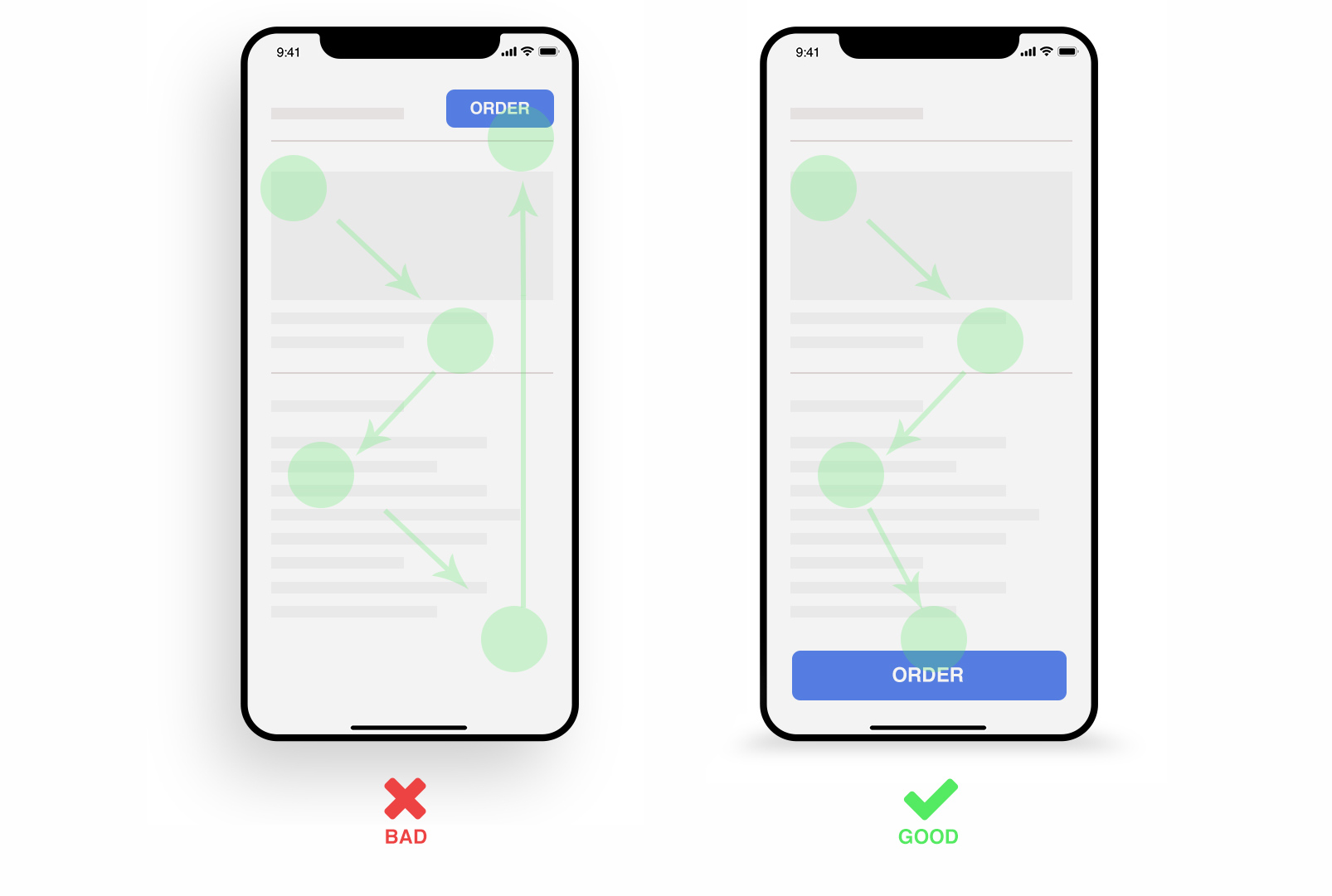
4. Simple, Thumb-Friendly Navigation
Mobile navigation should feel natural, not cramped.
Most website mobile-friendly designs heavily rely on:
- Hamburger Menus
- Sticky Headers
- Large, tappable buttons or touch targets
Menus, forms, and CTAs should be reachable without stretching or precision tapping.
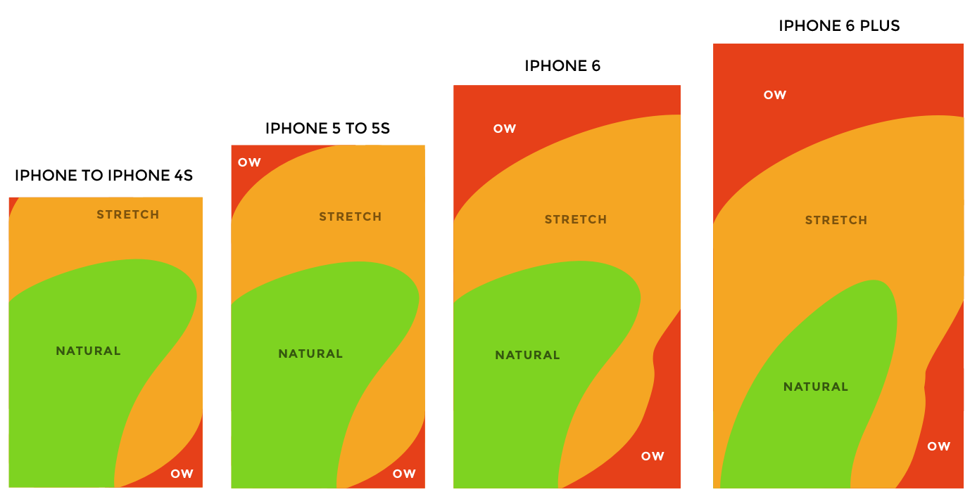
Thumb Heat Map
Practical Tips to Make Your Website Mobile Friendly
Use Readable Font Sizes
Start with at least 16px for body text and scale upward responsibly. Larger screens don’t mean smaller text clarity always wins.
Space Out Clickable Elements
Mobile users tap with fingers, not cursors. Buttons placed too close together cause misclicks and frustration.
Switch to a Single-Column Layout
Multi-column layouts may work on desktops, but they often break usability on phones.
A website mobile a mobile-friendly layout stacks content vertically so users can scroll naturally with one hand.
Code Snippet (Responsive Layout):
Optimize Images for Mobile
Images should scale, compress, and load appropriately for smaller screens without sacrificing quality.
Simplify Key Touch Points
Mobile users want fast answers and fast actions.
Common optimizations include:
Click-to-call buttons
Larger CTAs
Shorter forms
Prominent contact info
Avoid Intrusive Pop-Ups
Pop-ups often dominate small screens and interrupt the user journey.
If pop-ups are necessary:
Delay them
Make them easy to dismiss
Disable them entirely on mobile if possible
Test on Real Devices
Emulators help, but nothing replaces real testing.
Check your website mobile mobile-friendly experience across:
iOS and Android
Different screen sizes
Various browsers
Fresh perspectives often reveal issues you’ve overlooked.
Allow Access to the Desktop Version
Some users prefer the full desktop experience for detailed tasks.
Offering a “View Desktop Version” option gives users control without forcing compromises.
Final Thought: Mobile Friendly Is About Respecting the User
A website mobile mobile-friendly design isn’t just a technical upgrade, it’s a user-first decision.
When your site works smoothly on mobile, you communicate:
Professionalism
Accessibility
Trust
And in a mobile-first world, that trust often determines whether someone stays, clicks, or leaves.